Objective: To stand out from other cocktail bitters by presenting a high-end product, hewing more closely in look to storied whiskeys, scotches, and liqueurs. In addition to that, the brief included a desire to convey a sense of mystery, and a complexity of flavor.
I wanted to create branding assets that felt historically established, and mature. The heraldic family crest flanked by the quintessentially Oregonian blackberry and cherry, speaks to a pride in craftsmanship and an honor for native plants and ingredients.
Visual Branding / Ad Expressions / Packaging / Mobile App Concept / Postcards / Digital Painting / Writing
Ad Expressions
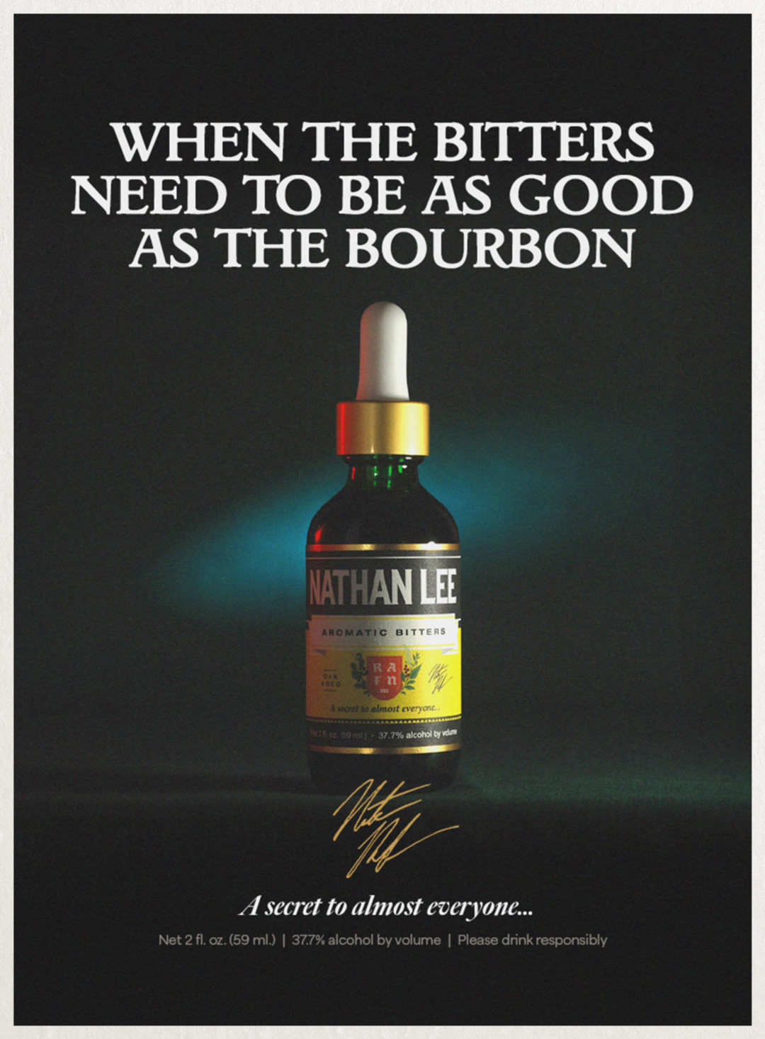
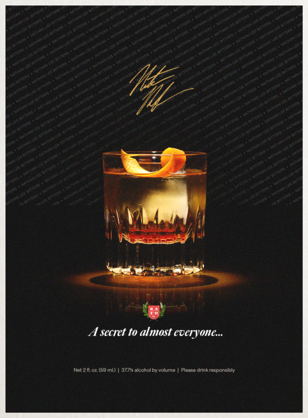
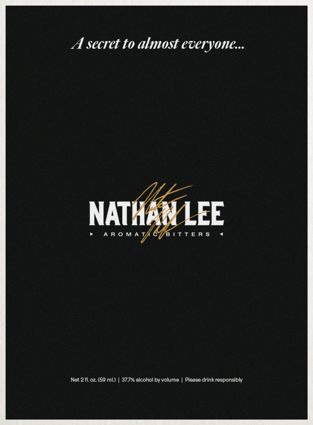
Magazine-style ads hearkening to an earlier time, fitting with the label design. Vintage in look, but agnostic enough in presentation to summon a variety of decades.


Research / Positioning
To position Nathan Lee as a standout bitters, we worked to evoke the trappings of unique and sought-after spirits. Adding a unique dropper, a branded box, and a premium price, we had our high-end yet idiosyncratic look.
Photography: Nate Rafn